

Which diamond color catches your eye first: luminous white, sunny yellow, blush pink, or an unexpected blue? It can be tempting to treat that answer like a personality test. A more useful approach is to ask what the color helps you express today. Jewelry can mark a memory, complement a wardrobe, or simply make an ordinary morning feel brighter. Its meaning belongs to the wearer.
This guide explores the style associations people often attach to diamond colors, then turns those impressions into practical buying decisions. The new editorial images below are styling illustrations, while the linked product images show actual Reikii Studio pieces.

Can a favorite color reveal your personality?
A color preference can tell a friend something about the look you enjoy. It cannot reliably diagnose your character. A study that directly tested popular claims about favorite colors and personality traits found no support for its tested predictions. Color meanings also depend on culture, experience, lighting, and context. That is why the descriptions in this article are invitations to play with style, not statements about who you are.
Think of color as a design language. A yellow stone can make a simple outfit feel warmer; a pink one can make a ring feel softer; a blue one can create a cool focal point. You may choose different colors for a celebration, a workday, or a gift. None of those choices needs to be permanent or fit a single personality label.
Start with the stone, not just its symbolism
Diamond color has a precise meaning in gemology. Near-colorless diamonds are graded on a D-to-Z scale based on the relative absence of color. Fancy color diamonds are evaluated for the presence of color: hue, tone, and saturation all matter. A word such as “pink” gives only part of the picture. A delicate pale pink and a strongly saturated pink may look entirely different in a finished piece.
Color can come from different features of a diamond's crystal structure. The Gemological Institute of America describes nitrogen as a cause of yellow color and boron as a cause of blue. Research on natural pink diamonds points primarily to distortions in the crystal structure. These facts explain appearance, not personality. They also remind us that a blue sapphire, green emerald, or pink sapphire should be described as its own gem rather than as a colored diamond.
What each color can express in jewelry
White: clarity and versatility
White or near-colorless diamonds have a crisp, light-catching presence. They fit someone who wants a piece to work with nearly everything, but that does not make the wearer conventional. A minimal white diamond stud can be quietly modern, while a large sculptural setting can be dramatic. White is a strong choice if you enjoy changing clothes, metals, and other gemstones without rebuilding the whole jewelry look.
For a personal twist, play with shape. An oval or pear can feel fluid; an emerald cut offers broad, architectural facets; a round brilliant emphasizes sparkle. Setting and silhouette often communicate more about a person's taste than color alone.
Yellow: warmth and optimism
Yellow reads as light, energy, and warmth in many styling contexts. A yellow diamond can brighten neutrals such as ivory, camel, chocolate, and black. It also stands out against deep navy or forest green. The feeling can be playful or refined depending on intensity, scale, and metal. A small yellow pendant in a simple setting feels easy for daily wear; a bold ring makes the color the center of the outfit.
Look at the stone under more than one light source. Warm indoor lighting can amplify its golden appearance, while daylight may reveal a subtler hue. If you want an unmistakably yellow look, pay attention to the actual color description and photographs rather than relying only on the product category name.

Illustrative look: one warm yellow accent can carry a restrained outfit.
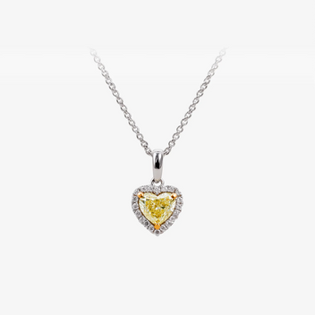 |
Explore a yellow diamond piece Sunlit Heart Yellow Diamond Pendant A warm-color accent designed to sit close to the neckline. See the product page for current price, materials, and availability. |
Pink: softness with presence
Pink is often used to suggest tenderness, celebration, or romance, yet it can also look sharp and contemporary. A pale pink stone against white metal feels airy. Rose or yellow gold makes the same hue warmer. A geometric setting can keep pink from feeling too sweet, while a heart or floral motif embraces that mood. Choose the version that feels natural with your wardrobe.
Pink is particularly interesting beside charcoal, cream, olive, or dark brown. If you normally wear neutral colors, it gives you a small, intentional point of color without changing your clothes. A pendant is an easy way to try the shade; a ring keeps the color in your own field of view throughout the day.

Illustrative look: blush pink can be subtle, graphic, or romantic according to its setting.
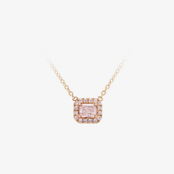 |
Explore a pink diamond piece Blush Halo Pink Diamond Pendant A softer color focal point for everyday or occasion styling. Check the product page for its current specifications and availability. |
Blue: cool contrast and composure
Blue can read as serene, graphic, or strikingly modern. A blue diamond set in white metal has a cool, clear quality; yellow gold adds contrast and warmth. With denim, a blue gem can feel casual. With black tailoring, it becomes a precise accent. This is a color to test beside the clothes you wear most, because the same stone can appear very different against pale and dark fabric.
Check the gem identity carefully. A blue sapphire is a beautiful alternative, but it is not a blue diamond. The two have different properties, pricing, and descriptions. If you are drawn to the color rather than a specific gem, comparing both can broaden your choices without blurring what you are buying.
Green: nature and contrast
Green jewelry often evokes growth, fresh leaves, or depth. A green diamond can look exceptionally distinctive, especially when its hue is set against warm yellow gold. Green emeralds create a different effect, with their own character and care requirements. If green is your favorite color, decide whether the gem species matters to you or whether the visual impression is the main goal.
Try a green accent with cream, tan, black, or deep blue. A pendant places the color near your face; a ring makes it more private and personal. If the piece has a large setting, check how the green appears in everyday lighting instead of judging only a brightly lit product photograph.
Orange, champagne, and brown: grounded warmth
Not every color story needs to be vivid. Champagne and brown diamonds can feel earthy, understated, and easy to wear. Orange is much more saturated and visually assertive. Together these shades span a range from quiet warmth to a clear statement. Pair them with cream, rust, cocoa, or charcoal, and choose a metal that either blends with the stone or supplies deliberate contrast.
A subtle brown or champagne tone can be especially attractive in a piece you want to wear often. It offers color without demanding that the rest of the outfit follow it. For a stronger orange appearance, inspect the hue in person if possible and read any grading or treatment information available for that exact stone.
Purple and red: rare-looking drama
Purple and red are often used to signal individuality, ceremony, or a bolder point of view. Natural diamonds with these hues are unusual, and visual examples online may also involve different gemstones or treatments. The right response is curiosity: ask what the stone is, whether its color is natural or treated, and what documentation comes with it. A purple sapphire or red ruby may deliver the color impression you want without being represented as a diamond.
These strong hues need little competition. Keep the surrounding pieces simple and let one gem, whether in an earring, pendant, or ring, be the focal point. If you enjoy changing your look, a saturated color can be reserved for special occasions rather than used as an everyday identity.
Color meanings are personal and cultural
The language attached to colors changes across places and generations. White can mean simplicity to one person and celebration to another. Pink may recall a loved one, a favorite dress, or a particular season. A blue stone might feel peaceful because it evokes the sea, or energetic because it resembles a vivid evening sky. Those associations are real as personal experiences, even when they are not reliable measurements of personality.
Fashion media and famous jewelry moments can introduce people to an unfamiliar shade. Repetition makes a color feel more familiar, but a trend is only a starting point. Before buying, imagine the piece without a celebrity photograph or campaign image. Would you still reach for it? That question often tells you more about its long-term place in your jewelry box.
How to choose a color you will actually wear
1. Begin with your existing wardrobe
Place three or four favorite outfits side by side and look for repeated colors. If you live in black and white, almost any gem can become a controlled accent. If you wear many patterns, a white or softly colored stone may be more flexible. Match the mood rather than every exact shade; a pink gem does not require a pink dress.
2. Decide where color should sit
A pendant brings color to the center of the outfit and is visible in photographs. Earrings frame the face, especially with hair tucked back. A ring is most visible to the wearer, so it can carry a private meaning even when it is small. Choose the placement that fits your daily routine before selecting a specific gem.
3. Compare color in real light
Gemstones can change appearance under daylight, warm lamps, and store lighting. Product photography can also vary with screens and editing. Look for multiple images or videos, ask for a description of hue and intensity, and compare the stone against your skin and clothing if you can. The question is not whether the gem matches a personality label; it is whether you enjoy its actual color in the settings where you will wear it.
4. Read the details beyond hue
Confirm the gem species, natural or laboratory-grown origin where relevant, treatments, metal, size, and setting. A fancy-color diamond is graded differently from a near-colorless one; a sapphire or emerald is a separate gem altogether. A grading report can help clarify a diamond's characteristics and color origin. For daily rings, also consider whether the setting protects the stone and fits your activity level.
| What to check | Why it matters | Useful question |
|---|---|---|
| Gem identity | Diamond, sapphire, emerald, and ruby are different materials | What exact gem is this? |
| Color description | Hue, tone, and saturation affect the finished look | How does it look in daylight? |
| Origin and treatment | These details affect expectations and documentation | What does the report or product page state? |
| Setting and scale | Size and metal change how the color reads | Will it work with my usual outfits? |
| Wear and care | Daily use differs from occasion use | Is this practical for my routine? |
Try a simple color exercise
Save one white, one warm, one cool, and one saturated jewelry image that you genuinely like. Ignore the color names for a moment. Look for what those pieces share: perhaps a small stone, a low-profile setting, a heart shape, or a bold outline. You may discover that scale or silhouette matters more to you than color. Then place the images beside two outfits you wear regularly and eliminate anything you would never actually put on.
If you are choosing a gift, begin with the recipient's habits rather than assigning them a personality by color. Notice whether they wear necklaces or rings, which metals appear in their collection, and whether their style is minimal or expressive. A familiar shape in a new hue can be safer than a color that seems symbolically perfect but does not match how they dress.
Frequently asked questions
Does my favorite diamond color reveal my personality?
No reliable test can reduce personality to a preferred gem color. You can still use a color's familiar associations as a creative way to express a mood, memory, or style preference.
Are colored diamonds and colored gemstones the same thing?
No. A blue diamond and a blue sapphire, for example, can look similar in a small image but are different gems. Check the product description and any grading documentation for the exact stone.
What is the difference between D-to-Z color and fancy color?
The D-to-Z scale describes the relative absence of color in diamonds. Fancy-color grading focuses on the visible color itself, including hue, tone, and saturation. The two systems answer different questions.
Which color works best for everyday jewelry?
There is no single best color. White is easy to combine, while a small pink, yellow, or blue accent can be just as wearable. Setting comfort, size, and compatibility with your wardrobe often matter more than the hue.
Can I mix two colored gems in one look?
Yes. Keep one color dominant and repeat a shared element such as metal, stone shape, or scale. A pink pendant and blue ring can feel considered if their settings have similar visual weight.
Choose the color, keep the meaning
A favorite diamond color does not define you. It gives you a way to tell your own story. Start with the feeling you want from the piece, then test the real-world details: the exact gem, its color in ordinary light, its setting, and how naturally it fits your life. When those things align, the jewelry becomes personal for reasons more meaningful than any personality chart.